win station kertoo ettätäältä .
Versio lienee kuitenkin … ???
Marko
7 October 2024 00:13
44
Hei, olet aivan oikeassa @Heikki_Aumala , tuo banneri jäi päivittämättä. Lisäämme uudet tiedot piakkoin.
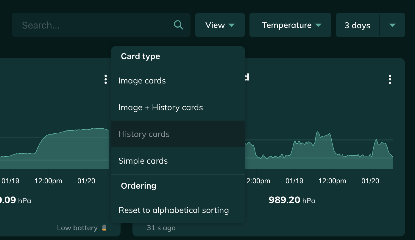
The dashboard card with no graph is sometimes useful since I have so many sensors, but I find being able to see all the graphs at once extremely useful. How do I get that view instead?
Marko
20 January 2025 00:16
48
Hello @DowneastUS ,
You can get this view by selecting History cards card type from the View dropdown menu.
I hope this is what you are looking for.
I assumed there would be an option to make it like was somewhere and I even tried the View pulldown, but there were only a couple of choices. History Cards and Image+HCs wasn’t there when I posted the question. Now I see in your screen shot Ordering and Reset options that I don’t have yet … can’t wait.
So far I have 15 sensors in two homes 2,900 km apart and am planning to add more. Great product!
1 Like
Marko
20 January 2025 04:28
50
@DowneastUS all of these features in this menu are available for all users, if this is not the case for you please contact us at support@ruuvi.com .
io53
19 February 2025 19:57
51
Ruuvi Station WebUI has been updated to version 1.2.3
Changelog:
Improved the dashboard sensor card layout.
Fixed a bug where unit settings were not used in dashboard cards.
Prevent autocomplete for share sensor email input field.
Other minor UI tweaks.
1 Like
io53
15 March 2025 07:29
52
Ruuvi Station WebUI has been updated to version 1.2.4 .
Changelog:
Data cache is now cleared when reloading the page with Ctrl + Shift + R (Cmd + Shift + R on macOS).
Added select all and clear buttons when adding sensors in the sensor compare view.
Fixed a bug where mmHg would show hPa value on the sensor page.
Improved behavior when changing the history length while data is loading on the dashboard.
Improved visibility for single data points in graphs.
UI tweaks and fixes.
io53
4 April 2025 16:48
53
Ruuvi Station WebUI has been updated to version 1.2.5 .
Changelog:
Data gaps in graphs now have a dotted line between datapoints.
Graphs on the dashboard and compare page can now also show datapoint dots.
A network error that incorrectly displayed “No data” has been fixed.
Rounding errors in graph statistics have been fixed.
The compare page graph x-axis range has been corrected if a sensor didn’t have data within the selected time range.
Graph lines that extended outside the graph area have been fixed.
1 Like
io53
23 April 2025 19:32
54
Ruuvi Station WebUI has been updated to version 1.2.6 .
Changelog:
Added 6-hour history option for graphs
Compare sensors view now has its settings in the URL, making it possible to bookmark specific comparisons
Graph zoom level is now kept when switching between different units
Fixed a very slight rounding error in the absolute humidity calculation
UI fixes
1 Like
io53
23 June 2025 21:09
55
Ruuvi Station WebUI has been updated to version 1.2.7 .
Changelog:
Improved dashboard layout to handle sensor cards of different sizes
Added dotted line for data gaps in comparison graph
Allow bigger temperature alert ranges when editing manually
Fixed issue where zoom would reset when data was updated
Fixed issue on sensor page graph where y-axis label was not fully visible
Fixed issue with pasting activation codes on safari
Fixed graph data gap dotted line not being correct color in alert state
UI tweaks
1 Like
io53
25 August 2025 19:59
56
Ruuvi Station WebUI has been updated to version 1.2.8 .
Changelog:
Made all dashboard cards the same size.
Fixed issue where changing settings too quickly could cause an error and not save.
Minor bugfixes and tweaks.
1 Like
io53
6 October 2025 21:35
57
Ruuvi Station WebUI has been updated to version 1.2.9 .
Changelog:
New dashboard sensor card design
Improved sensor and sensor data caching
Fixed pressure alert slider range issues
Fixed dashboard card alignment
Minor UI tweaks, localization and bug fixes
2 Likes
io53
30 October 2025 22:06
58
Ruuvi Station WebUI has been updated to version 1.2.10
Changelog:
Settings are now automatically refreshed every minute in the background (sensor order, units, etc.)
Improved Ruuvi Air export and adjusted export labels
Unified AQI color range with mobile apps
Added missing and corrected translations
Fixed issues with resolution settings not being applied correctly
Improved dashboard alert visibility in light theme
Adjusted sensor card visuals (shadows, spacing, smaller values on mobile)
Fixed various Air Quality and data display inconsistencies
Numerous UI and stability improvements
1 Like
io53
8 January 2026 19:21
59
Ruuvi Station WebUI has been updated to version 1.3.0
Changelog:
Added Visible Measurements feature that allows showing, hiding, and organizing measurements for each sensor
Selected unit on Sensor page is now added to URL and preserved when navigating between sensors
Added relative humidity, absolute humidity, and dew point to Dashboard sensor unit dropdown
Improved formatting for “Last Seen” timestamp when sensor has been offline for a long time
Alert settings now depend on Visible Measurements, alerts can only be set for visible measurements
Reduced items under “More Info” section, all measurements can now be shown using visibility settings
Updated dialog and texts for Sensor Info button on Sensor page
Fixed focus issue in MAC Address input field in Add Sensor dialog
Fixed issue where dew point was always displayed in °C
Minor UI improvements and bug fixes
1 Like
io53
15 January 2026 06:32
60
Ruuvi Station WebUI has been updated to version 1.3.1
Changelog:
Added an option to disable the adaptive (masonry) layout for the dashboard
1 Like