Kiitos palautteesta. Meidän täytyy hiukan miettiä kuinka tämä saataisiin tehtyä järkevästi, antureiden toiminnan luonteeseen kuuluu että data ei tule tarkalla intervallilla mutta toisaalta vaikkapa 30 minuuttia + katkos voitaisiin varmaankin tulkita puuttuvaksi dataksi.
Laitan tästä viestiä UI-puolelle ja mietimme mikä olisi paras tapa esittää datakatkokset
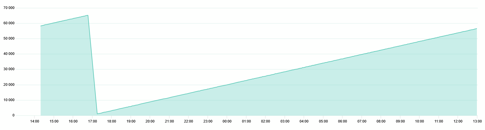
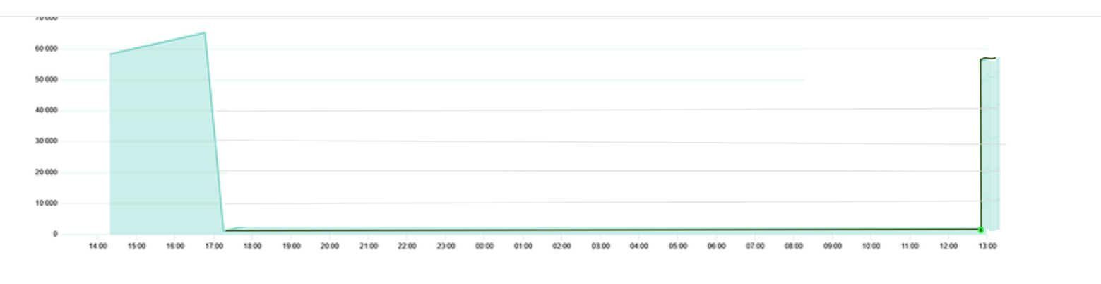
Tässä nimenomaisessa kuvaajassa olisi varmaan parempi pitää viimeisin arvo datan puuttuessa, sen sijaan että vedetään viiva kahden peräkkäisen pisteen välille.
harriv posted:
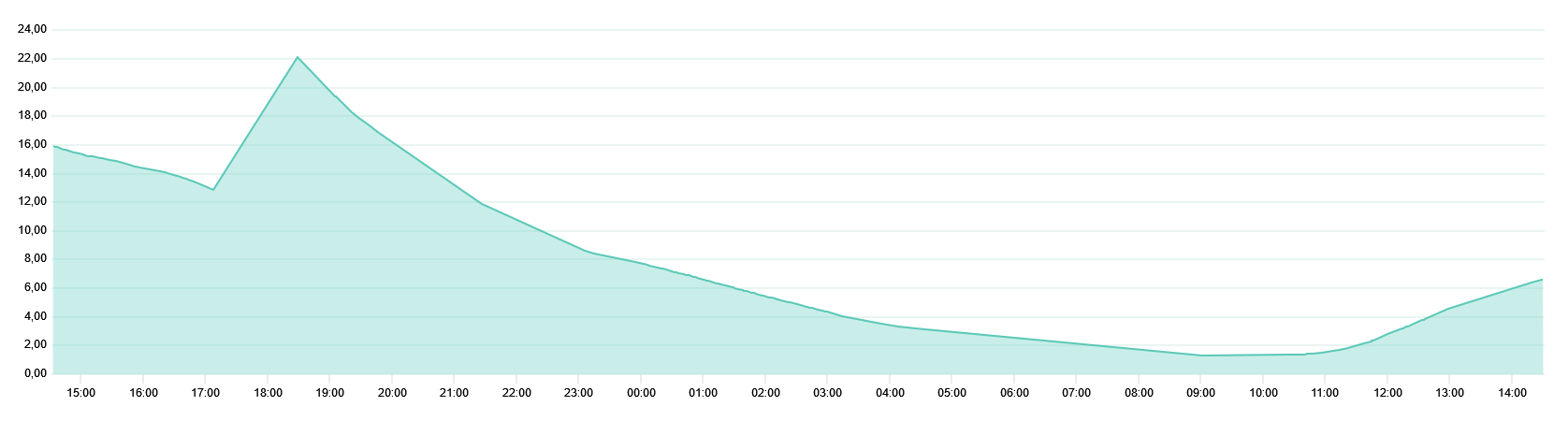
I myself have one sensor a bit “borderline” and I don’t really see the web interface because there is a lack of data:
…
In that image, for example, no data has been received between about 4:30 and 9:00.
Could there be either an opening in the line, a gray color, etc. highlighting so you would immediately understand a lot of data is missing.
Direct interpolation over several hours is perhaps the worst option, even if it looks best visually.
++++
otso replied:
Hey,
Thank you for the feedback. We need to think a little bit about how this could be done sensibly, the nature of the operation of the sensors is that the data does not come at a precise interval but on the other hand 30 minutes + a break could probably be interpreted as missing data.
I’m putting this post on the UI side and wondering what would be the best way to present data breaks
++++ harriv responded:
In this particular graph, it would probably be better to keep the last value in the absence of data, rather than drawing a line between two consecutive points.
As per google translate. Please let me if there is better wording and I will edit it
One approach might be to inject an artificial point at the same y-axis level at the point that data resumes. It’s not great but I think it’s better than the triangular shape.
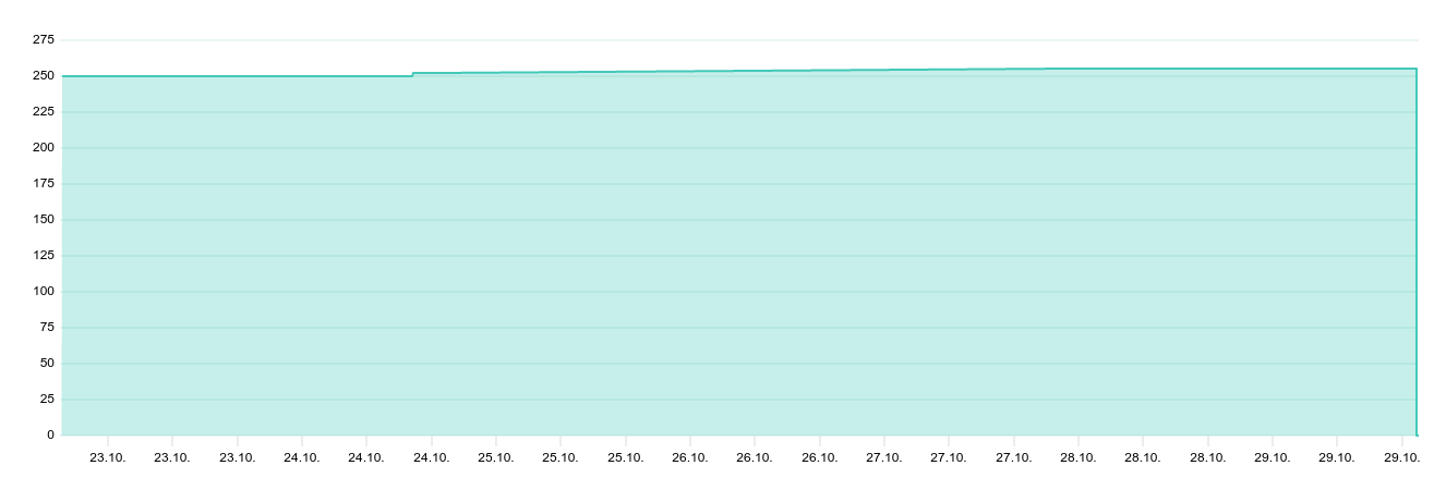
Lisätään vielä tähän ketjuun, että liikelaskurin kuvaaja ei ole kaikken paras, jos raportointijaksolla on muutos 255 → 0. Yksittäiset laskurin muutokset ei oikein erotu:
harriv added:Let’s add to this that when zooming in the web browser, is there a way to zoom out or reset the zoom?
Otso replied: Resetting the zoom is currently only possible by selecting the time range of the graph again, I opened an issue for us: Zoom out / reset zoom button · Issue #67 · ruuvi/com.ruuvi.station.webui · GitHub 7
harriv responded: Let’s add to this chain that the graph of the movement counter is not the best if the reporting period has a change from 255 → 0. The individual changes of the counter are not really distinguishable: