Kiitos palautteestasi. Kuvaajat pyritään aina esittämään niin, että sekä minimi ja maksimiarvot mahtuvat valitulle aikajaksolle. Tämä näkyy helpoiten esimerkiksi tarkastellessa lämpötilaa, mutta se ei toki välttämättä näy kovin helposti tarkastellessa kuvaajaa, jossa muutokset ovat marginaalisia. Sama logiikka on käytössä myös mobiilisovellusten historianäkymässä. Webbikäyttöliittymän koontinäytössä ei ole mahdollista käyttää XY-zoom-toimintoa, mutta yksittäisen anturikortin kuvaajassa se on toki mahdollista. Tarkoituksena koontinäytöllä on tosiaan esittää ylätason tietoa, jolloin tiedon mahduttaminen kuvaajaanäkymään on oleellista.
Harriv requests:
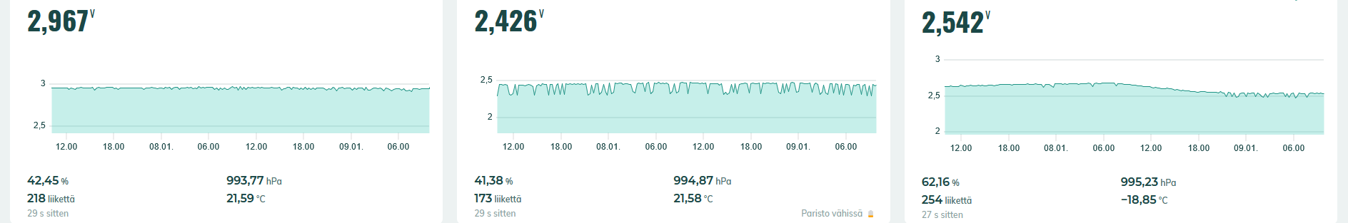
In Ruuvi Station’s web user interface, to facilitate data comparison, it should be possible to select the same Y-axis scale for all tags.
For example, if the battery voltage is a little dim, the top line is between 2 and 3.5V.
Even when comparing temperatures, it would be good if there was at least an option to choose a matching scale.
Marko replied: Hi harriv,
Thank you for your feedback. The aim is always to present graphs in such a way that both the minimum and maximum values fit in the selected time period. This is most easily seen, for example, when looking at the temperature, but of course it is not necessarily very easy to see when looking at the graph, where the changes are marginal. The same logic is also used in the history view of mobile applications. It is not possible to use the XY-zoom function in the overview screen of the web user interface, but it is of course possible in the graph of the individual sensor card. The purpose of the summary screen is really to present top-level information, in which case fitting the information into the graph view is essential.