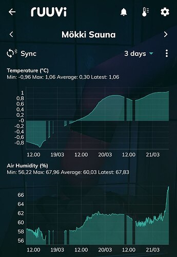
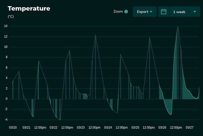
We’ve received some questions regarding a recent change in how history graphs are drawn in our latest Android app. The graphs no longer appear continuous if there are long gaps between data points. This same display logic has been used in the web interface for quite some time and was also introduced in the iOS app earlier this year. The purpose of this change is to provide a more accurate representation of the measurement history.
The logic behind this is simple: if data points are more than one hour apart, no connecting line is drawn between them.
We made this change because there is no information about what happened during those gaps, and we don’t want to give users a misleading impression that measurements were being taken continuously. By default, the app doesn’t show individual data point markers (and this isn’t even possible in the iOS app), so drawing lines between infrequent points has previously caused confusion—some users assumed there was continuous data when in fact there wasn’t, which in some cases led to issues like frozen water pipes going unnoticed.
So, nothing is broken—this change is intended as an improvement to the user interface.
Here’s an example image showing how the history view looks in the latest app version:
We hope this helps clarify the purpose and implementation of the feature. We welcome all feedback and improvement suggestions, so please let us know if you have any further thoughts.
Note: By pressing the “Sync” button in the top left corner above the history charts, you can download any missing history data via Bluetooth from your Ruuvi sensors—provided you are within Bluetooth range.
Note2: If you have a Ruuvi Gateway and are using the Free plan of the Ruuvi Cloud subscription, the app cannot download full history data from the cloud. However, the mobile app does refresh a single data point from the cloud each time it is opened, and this point is saved to the phone’s local database. These individually stored points are visible in the history view. This explains why some users may have recently seen only a few data points in their history.

